BA (Hons) Graphic Design
Duration
3 years / 4 years with placement year*
Institution code
L28
UCAS Code
3 years W214 / 4 years W215

Duration
3 years / 4 years with placement year*
Institution code
L28
UCAS Code
3 years W214 / 4 years W215

&w=3840&q=75)
Tom Aggett
&w=3840&q=75)
Raya Ayoub

&w=3840&q=75)
Will Broadbent

&w=3840&q=75)
Ruby Brown

&w=3840&q=75)
Molly Dunn

&w=3840&q=75)
Sophie Henton
&w=3840&q=75)
Joe Hall
&w=3840&q=75)
Amira Mutiara
&w=3840&q=75)
Amira Mutiara

&w=3840&q=75)
Josh Wilmot

&w=3840&q=75)
Ben Wright
This course offers the opportunity to become creatively capable, critically informed, professionally aware, and culturally sensitive. You will work individually and collaboratively to produce extraordinary work in a modern studio environment.
We offer all our students a unique and engaging learning environment. Investigation takes place practically through materials and process, theoretically through research and analysis, and is rooted in professional practice.
The relationship between critical theory, professional contexts, and design is vital. Problem-solving encourages increasingly individual exploration of processes and techniques. Student have access to studio space equipped with industry standard tools and technology, and a wide range of other workshops and specialist equipment.
Collaboration is central to our ethos and essential in developing design practice that has a readiness for professional application. We believe that an understanding of the collaborative role of the designer and appreciation of the interdisciplinary nature of contemporary design is significant for a successful engagement with the creative industries.
Our links with studios and agencies are extensive and external engagement is a course strength. Experts run workshops on professional and practice-based specialisms, give studio talks and lectures, and portfolio surgeries. Live briefs are also set by studios, individual practitioners, and organisations within the wider creative sector and beyond.
We encourage engagement with the creative sector, which develops the confidence and understanding to allow you to make informed decisions about the future, whether preparing for this exciting industry or further study.
*The placement year is subject to approval.
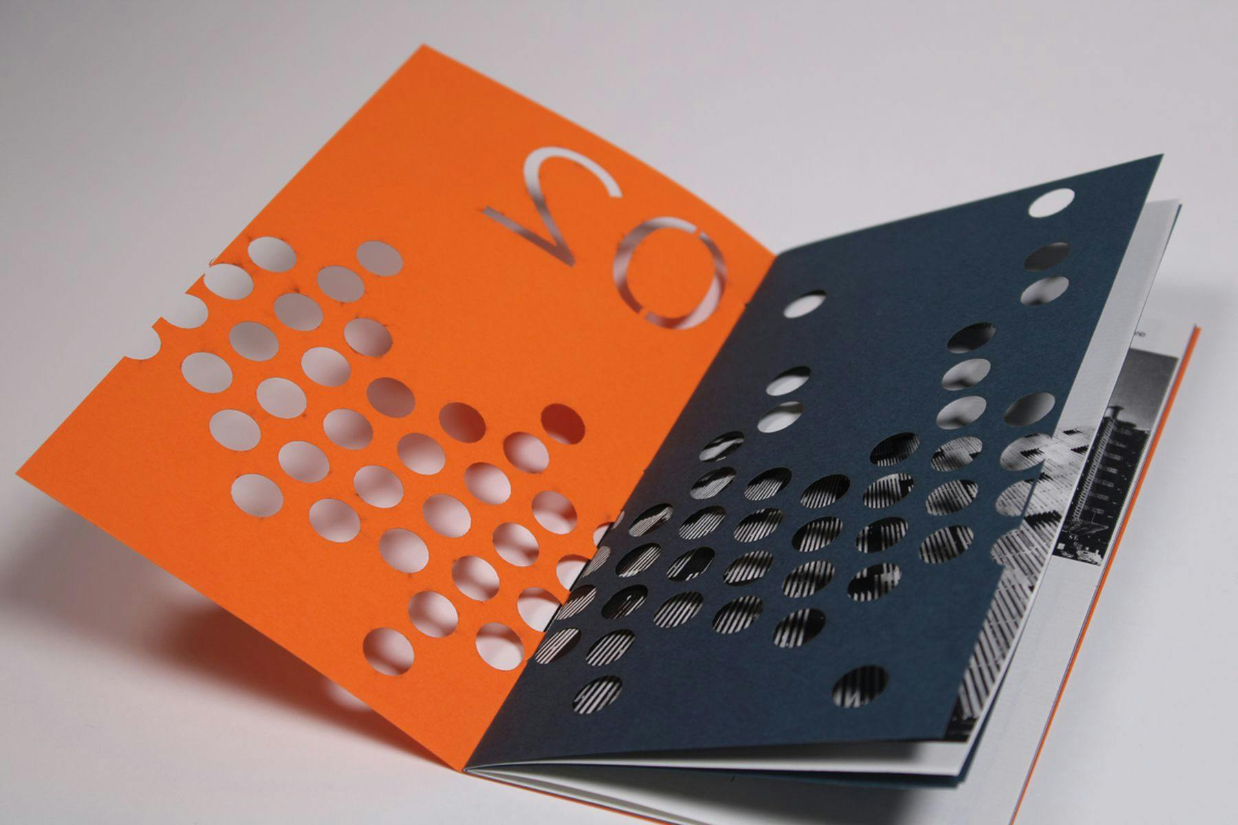
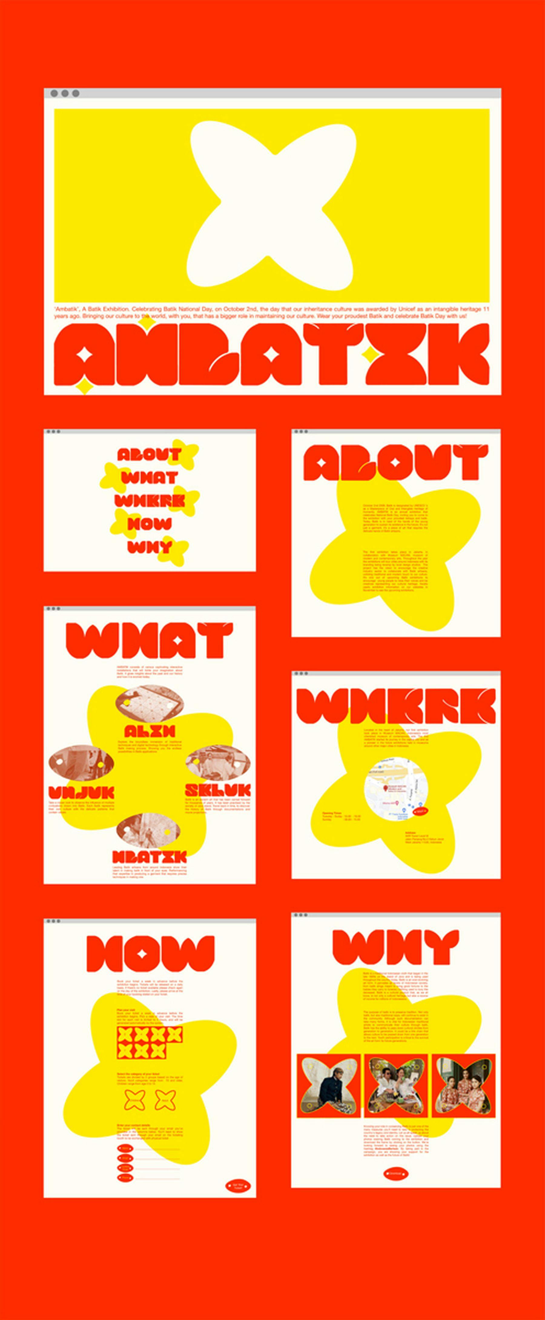
Working in dedicated design spaces, you will focus on the fundamentals of visual language. You will investigate methods and design practice around type, language, image, narrative, meaning, and message. You will also explore typography, print, drawing processes, and screen-based media to form a comprehensive understanding of graphic design.
BA (Hons) Graphic Design students are based in a large, purpose-built shared studio. Students will have access to a wide range of resources with a drop-in facility so work can be undertaken, provided resource inductions have been completed.
For Graphic Design students this will include print resources which provide excellent facilities for bookmaking and paper-based printmaking using a range of processes; access to industry standard laser cutters; professional-standard, large-format digital printing and print finishing and a vinyl cutter enabling designs to be cut from many types of vinyl.
Computer suites house networks of Apple Mac computers featuring regularly updated, industry-standard software for a wide range of creative applications that support all our courses and a purpose-built specialist library which includes including special collections of artists’ books, photobooks and illustrated books as well as the University archive. Self service facilities are available throughout, supported by a dedicated and experienced team of library staff.

&w=3840&q=75)
BA (Hons) Graphic Design
Studying abroad can help Leeds Arts University students gain valuable experience, broaden their horizons, develop international networks and experience their practice from a different perspective. Leeds Arts University has a global network of international partner universities in 15 different countries. Students can apply for a semester abroad in their second year of study.
Students have won countless awards including D&AD New Blood Award, International Society of Typographic Designers, Penguin Book Awards, YCN Student Awards, RSA Student Design Awards and Starpak Students Awards.
Graduates go into a range of careers within graphic design which include working within a studio as part of a design team, in-house or set up their own studios. Careers include editorial design, branding, packaging, typography, printmaking, design for screen and more. Graduates may also continue to postgraduate study, including onto our MA Graphic Design.
&w=3840&q=75)
*Please note that our courses are subject to an annual review process in order to maintain their quality and enhance the student experience. As a result, Course Specifications may be amended for the coming year.
Join our mailing list


&w=3840&q=75)
&w=3840&q=75)
&w=3840&q=75)
&w=3840&q=75)
&w=3840&q=75)
&w=3840&q=75)
&w=3840&q=75)
&w=3840&q=75)
&w=3840&q=75)
&w=1920&q=75)
&w=1920&q=75)
&w=1920&q=75)