Extended Diploma in Creative Practice
Duration
2 years
Institution code
L28
Validated by:
University of the Arts, London

Duration
2 years
Institution code
L28
Validated by:
University of the Arts, London
&w=3840&q=75)
Jovairia Akbar
&w=3840&q=75)
Jovairia Akbar
&w=3840&q=75)
Abigail Exon
&w=3840&q=75)
Ben Mee
&w=3840&q=75)
Beth Moore
&w=3840&q=75)
Millie Beck
&w=3840&q=75)
Millie Stoker
&w=3840&q=75)
Phoebe Townsend
&w=3840&q=75)
Ruby Hollingdrake
&w=3840&q=75)
Amber Edwards
&w=3840&q=75)
Erin Shaw
&w=3840&q=75)
Francesca Barber
&w=3840&q=75)
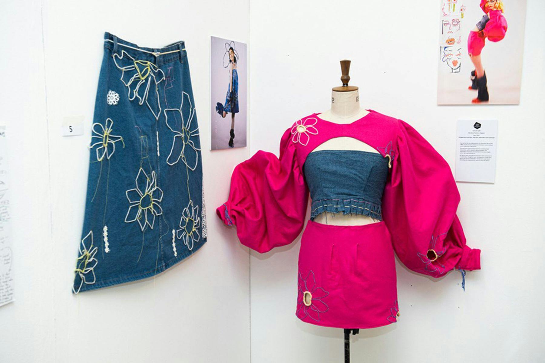
Summer Lyte
&w=3840&q=75)
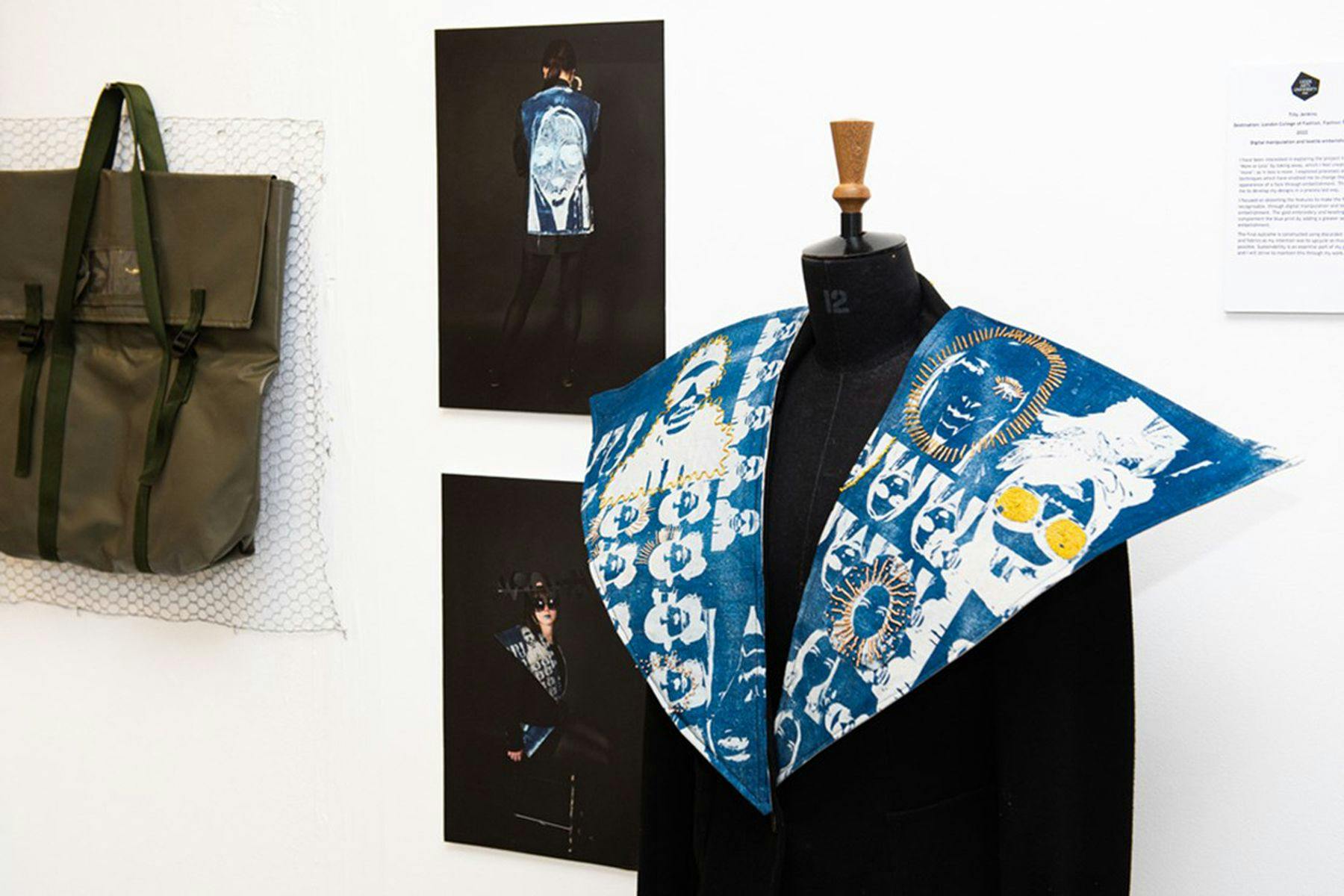
Tilly Jenkins

&w=3840&q=75)
Esme Oswin
&w=3840&q=75)
Frankie Ship
&w=3840&q=75)
Jenny Wong
This two-year course is an attractive coursework-based alternative to A-levels and provides a transformative bridge between school and university. Based at our city centre Vernon Street site, it offers students with an interest in visual arts the opportunity to explore and develop their creativity within a specialist, stimulating, and supportive environment.
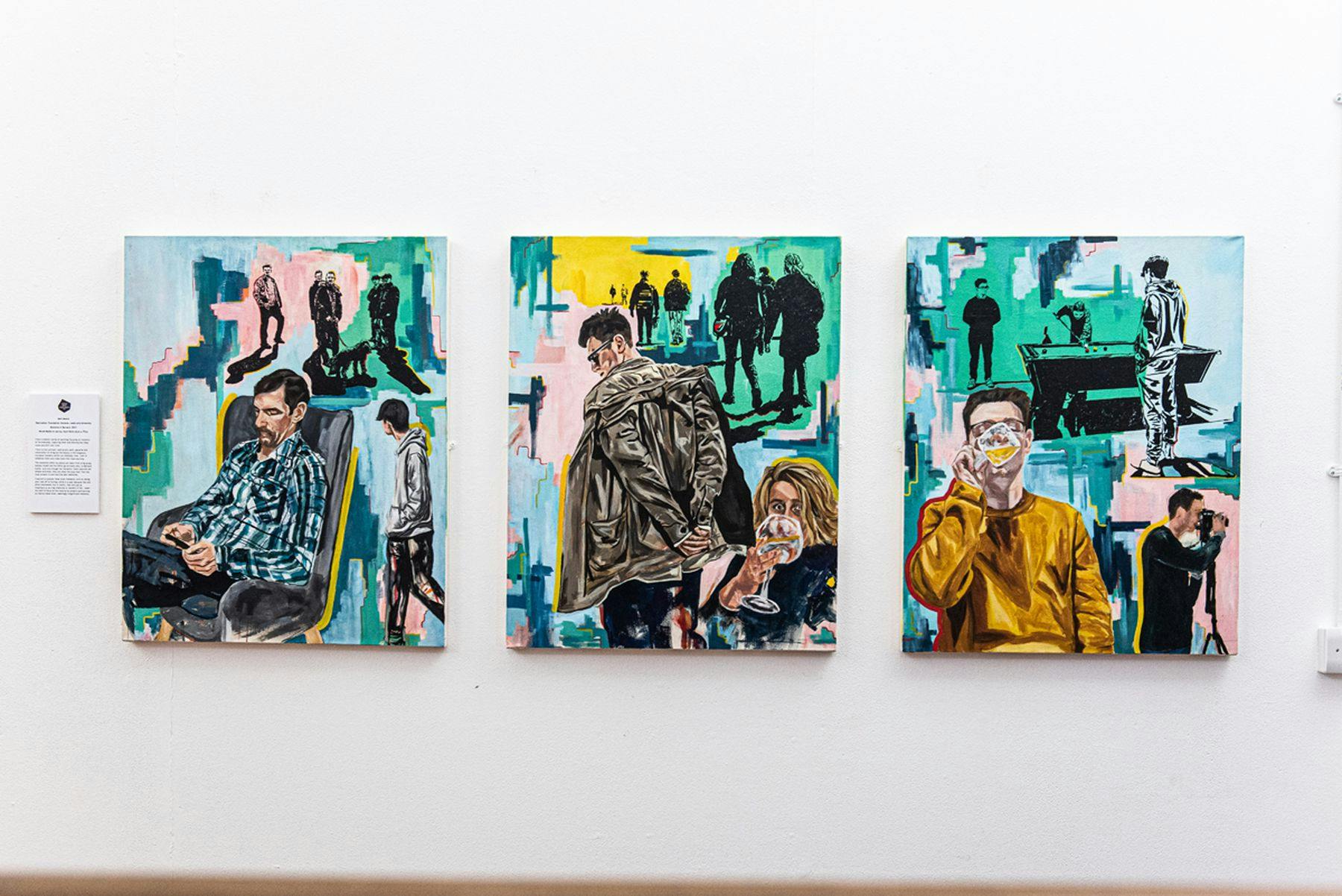
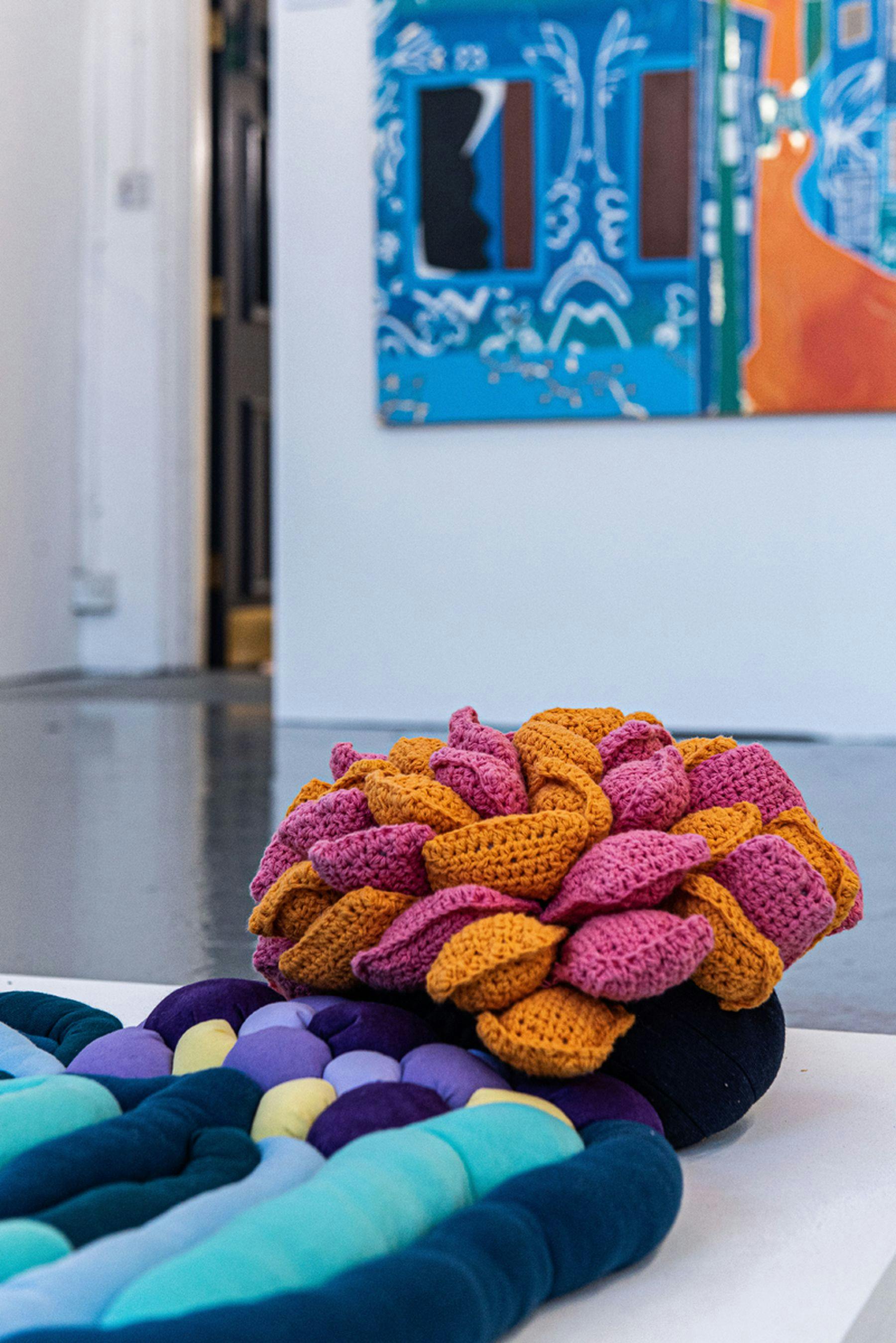
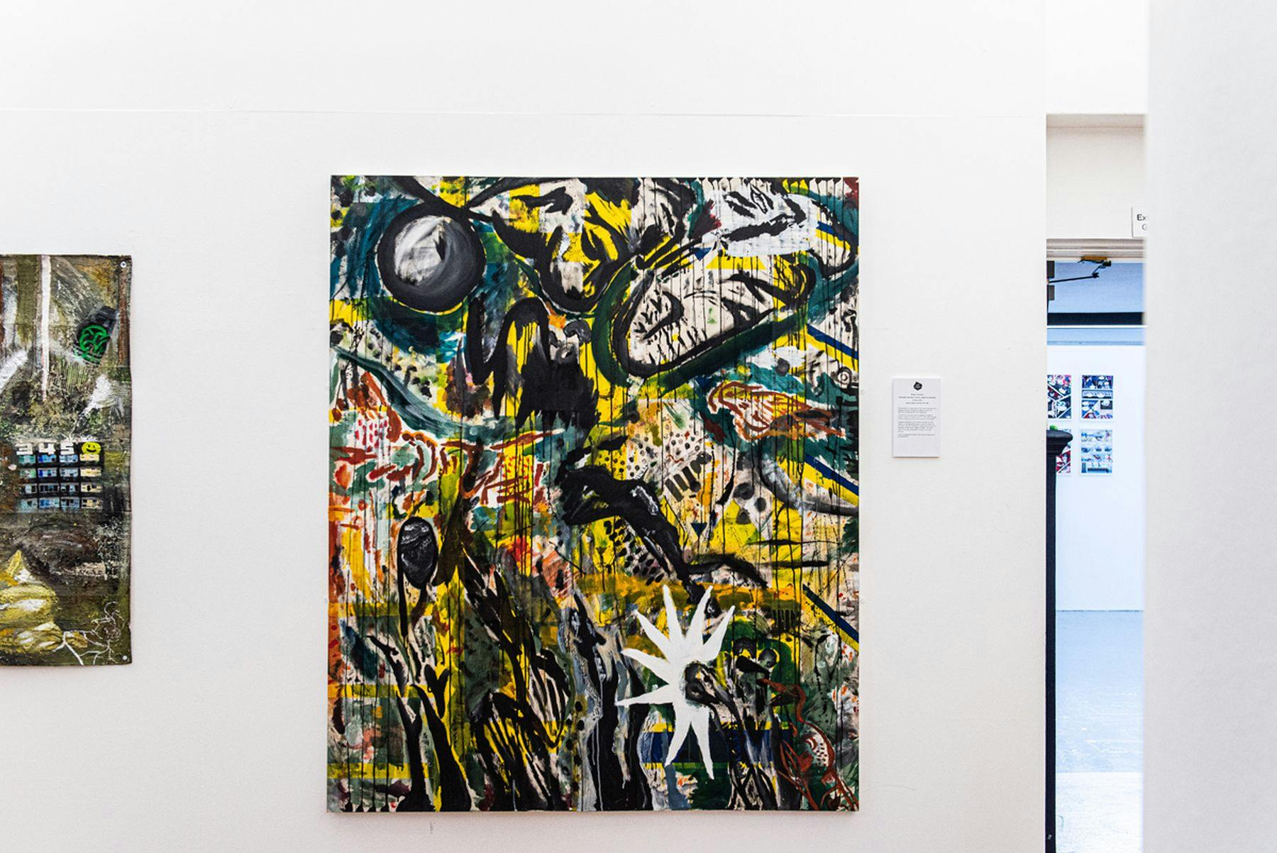
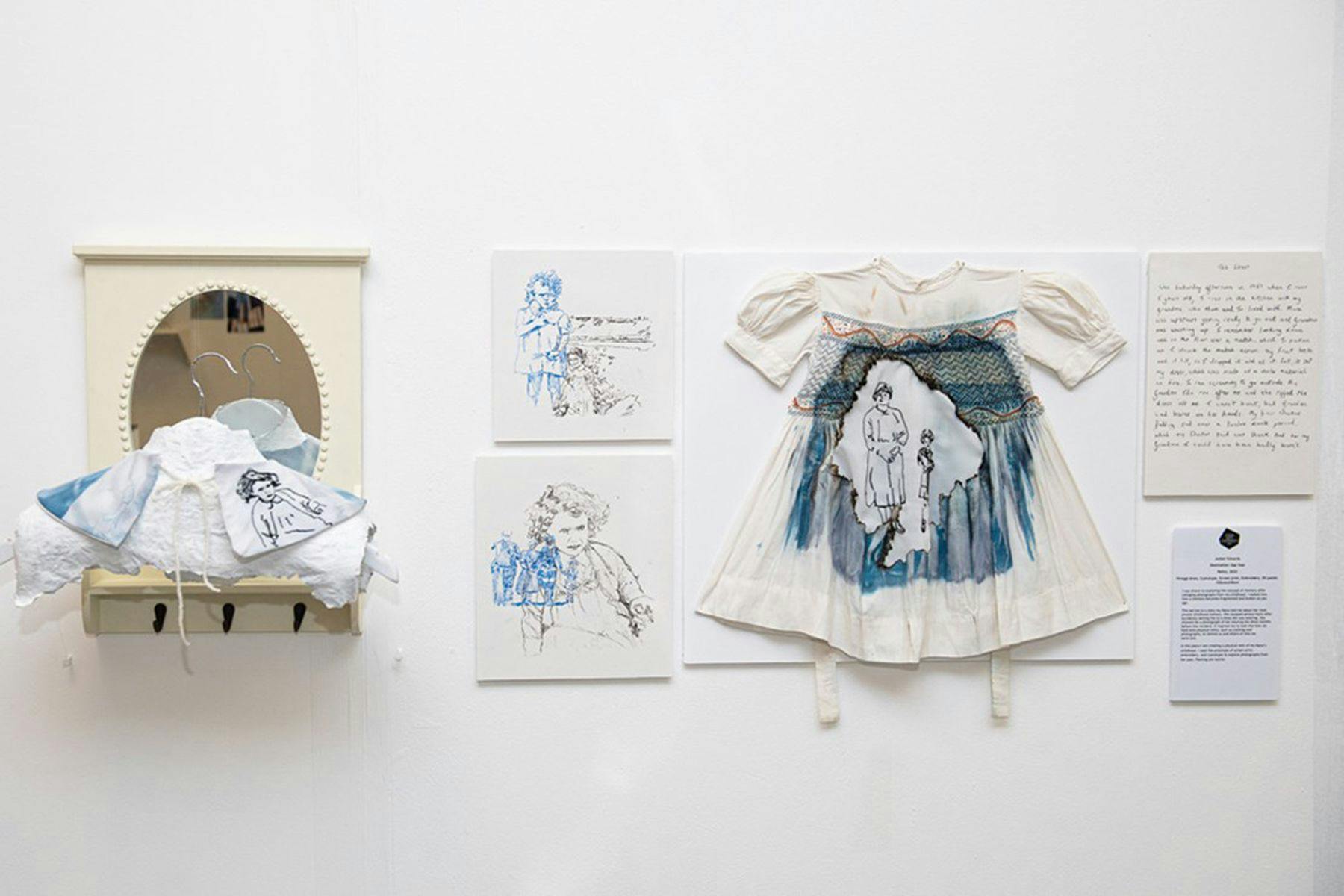
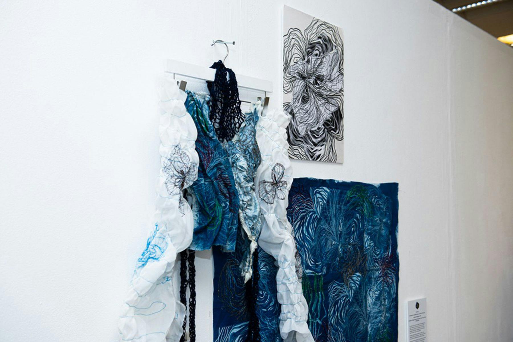
The course has been designed to provide the skills, knowledge, and understanding to help you discover your talents. We nurture individual strengths through a wide range of visual disciplines, and during the course you will specialise in one of four pathways: Fashion and Textiles, Fine Art, Graphic Communication, or 3D Design.
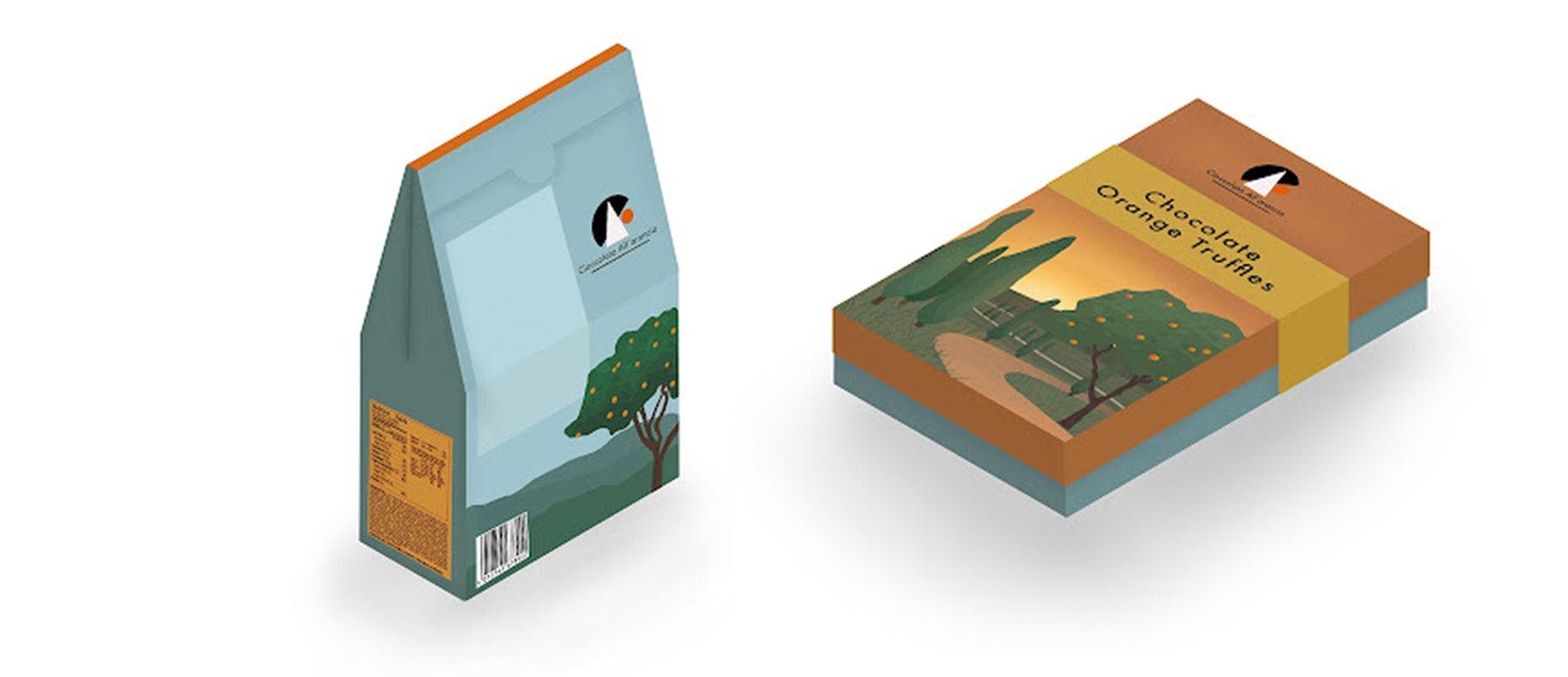
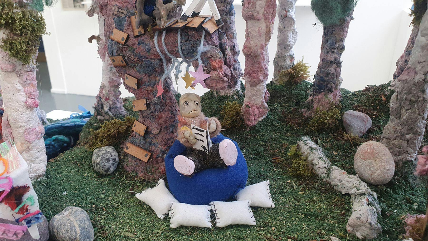
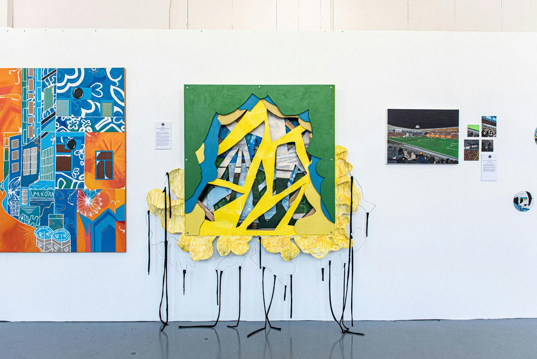
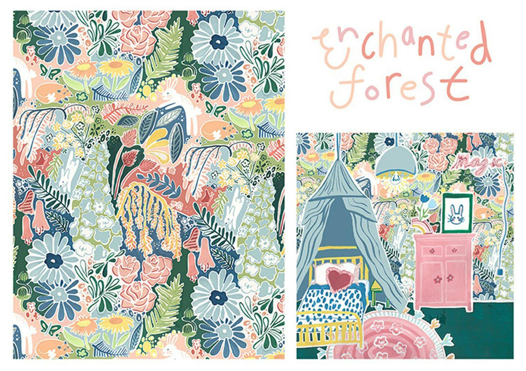
Several disciplines are introduced within each pathway. Fashion and Textiles may, for example, focus on fashion or costume design, fashion marketing, or textile design. Fine Art can include painting, printmaking, sculpture, time-based media and installation. Graphic Communication can incorporate graphic design, comic and concept art, games art and games design, illustration, animation, marketing communications, photography, and filmmaking. 3D Design can involve product design, interior design, design for stage and television, design crafts, and architecture.
You will also develop important employability and communication skills and be guided on further study and career opportunities within the creative industries. Students benefit from an enrichment programme of industry speakers, competitions, and live/simulated briefs.
Upon successful completion of all units, the overall grade for the qualification will be achieved through the assessment of a final unit of course work and is the equivalent of three A-levels.
![]()
Our latest Ofsted inspection judged our further education provision overall as ‘Good’. Both the quality of education and the personal development of our students was deemed ‘Outstanding’.
You’ll be introduced to the underpinning principles of art and design theory and practice to inform the development of your creative, practical skills. Exploring different approaches and experimentation with a range of media, techniques, and processes allows you to discover individual strengths and interests. This helps you to decide which specialism to choose. You’ll finish the year by undertaking a major project in either Fashion and Textiles, Graphic Communication, 3D Design, or Fine Art.
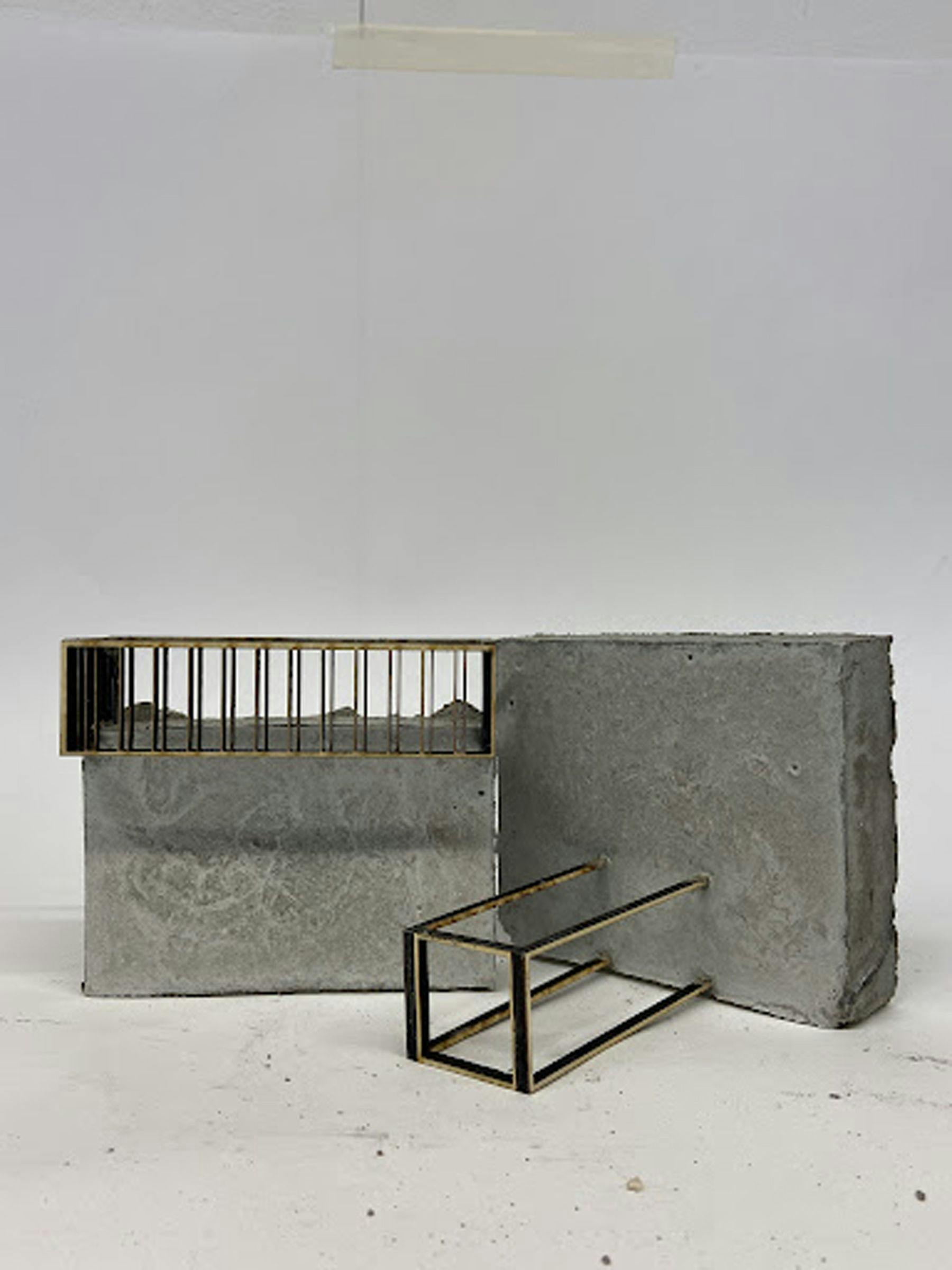
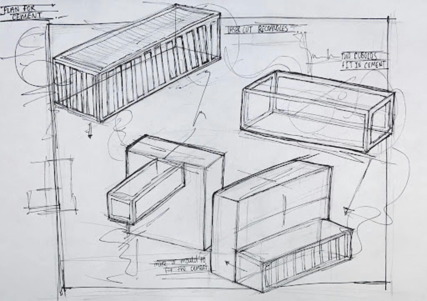
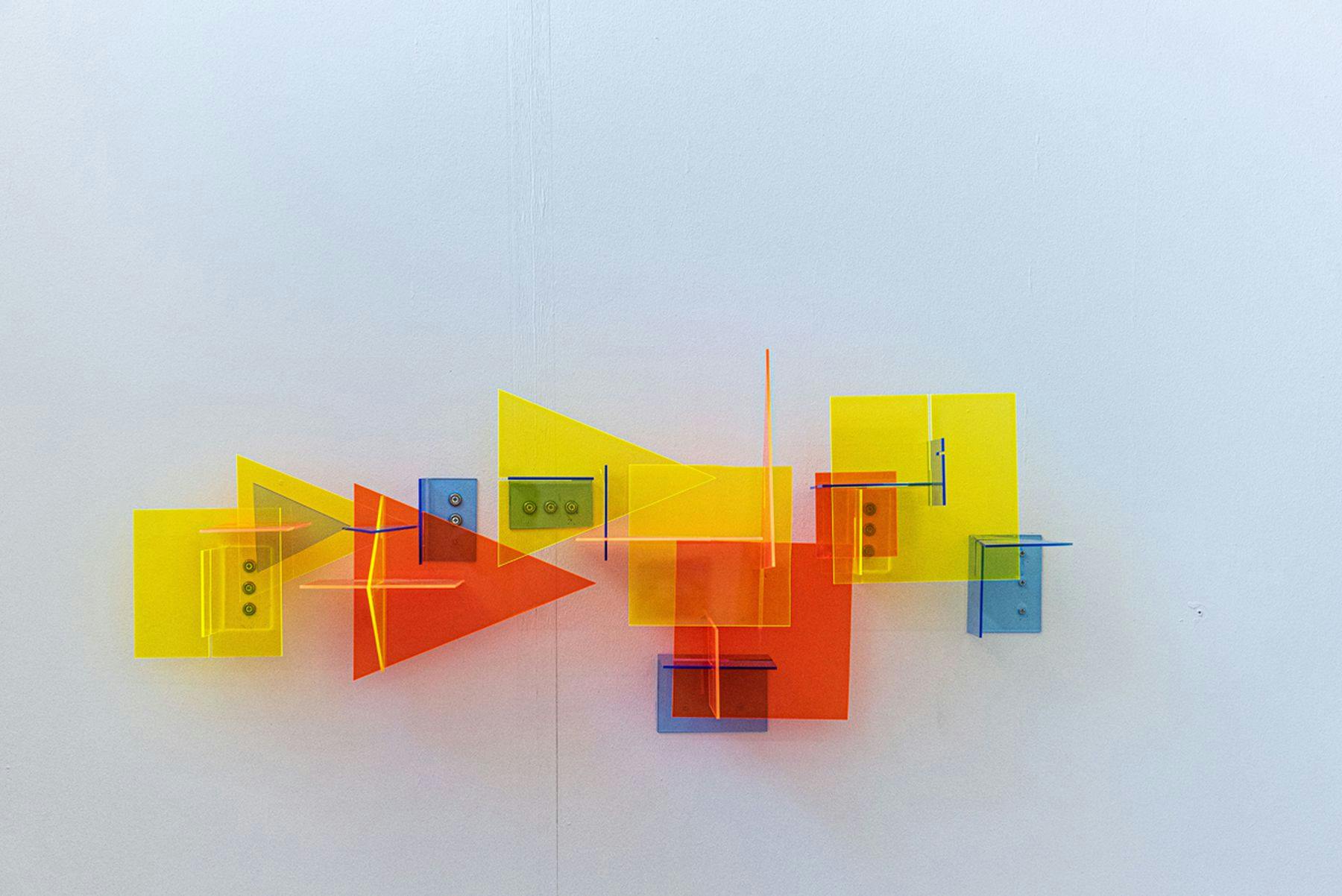
Three-Dimensional Design is about designing objects and spaces. These objects might be the functional items we use every day, such as mass-produced products (the ‘tools of life’), or the spaces we occupy or visit, rooms, interiors, buildings, and the spaces in between buildings (‘the spaces of life’). By studying on the 3D design specialism you can explore practices such as interior design, spatial design, product design, design for stage and television, architecture, craft design, landscape architecture, furniture design, and automotive design.
On the 3D Design pathway you will do a number of briefs which give you the opportunity to nurture and develop your emerging interests and direction in your creative practice. You will learn about the design process, consider ethics, sustainable and safe working practices. You will develop skills in resistant materials and workshop techniques to include wood, metal and plastic manipulation, casting, vacuum forming and laser-cutting. You will learn how to generate ideas for design solutions using drawing, diagrams, model making, photography, CAD, animation and film; and you will learn about contemporary and historical design.
Further education students have access to resources based at our Vernon Street campus all run by experienced instructors. Students are introduced to a wide range of materials and processes that assist their studies depending on their course specialties. These include:
Computer suites housing networks of Apple Mac computers, with regularly updated, creative software.
A specialist art library with print and online resources to support studies in the creative arts, and a not-for-profit shop selling a wide range of materials.
Print workshop which includes extensive facilities for screen-printing, traditional printmaking and bookbinding.
Photography resource with a range of equipment for loan including digital and film cameras for still and moving image and a range of support equipment for use in the dedicated lighting studio or off-site.
Photography facilities with black-and-white film processing and printing facilities.
Wood, metal & casting workshop equipped with industrial-standard machinery, supplemented by hand- and power-tools.

&w=3840&q=75)
Extended Diploma in Creative Practice
At Leeds Arts University, our further education courses are designed to help you grow not just as an artist or designer but as a confident and adaptable individual ready for progression in the creative sector. Guided by the Gatsby Benchmarks, our study programme combines personalised career guidance, personal development, specialist skills training and industry insights, alongside employability skills.
The programme equips you for your next steps—whether that’s university, an apprenticeship, or entering employment. It blends hands-on learning, expert advice, and opportunities to develop the skills you need for the creative sector.
We tailor your study programme through an Individual Learning Plan (ILP) to meet your goals. Your ILP is informed by your progression aims, assessments, and regular tutorials with experienced tutors or external careers advisors.
• Specialist Careers Programme: Receive personalised, ongoing support to help you make informed decisions about your career in the creative sector.
• Internal/External Careers Services: Access both internal and external impartial career coaching and developmental workshops that offer opportunities to grow your professional skills.
• Industry Insights: Gain a deeper understanding of the job market through specialist tutors, alumni talks and interactions with industry professionals.
• Live Briefs and Competitions: Work on real-world projects and specially designed briefs that replicate industry standards. Showcase your work at exhibitions and sell your creations at our art market. Access competitions and job opportunities through our VLE/careers portal and sign up for a regular newsletter with opportunities based on your own interests.
• Workshops and Portfolio Building: Develop specialist skills through workshops and tailored portfolio development.
• CV, UCAS, and Application Support: Get personal guidance for applications — whether for university, apprenticeships or employment.
• Personal Development: Grow as an individual by building skills and confidence and by looking after your well-being. This includes:
Time Management and Organisation: Learn to balance responsibilities and meet deadlines.
Presentation and Problem-Solving Skills: Gain confidence in sharing your ideas and tackling challenges creatively.
Financial Skills: Develop budgeting and money management, from navigating student finance to pricing your work for sale in opportunities like the art market.
Our students’ breadth of experience and impressive portfolios leads them to secure places on specialist degree courses across the country (including those at Leeds Arts University) and pursue careers in various fascinating fields. These include animation, illustration, graphic design, film, games art and games design, marketing communications, fashion design, fashion marketing, textile design, photography, architecture, product design, design for stage and film, sculpture, concept art, and fine art.
&w=3840&q=75)
Join our mailing list
&w=3840&q=75)
&w=3840&q=75)
&w=3840&q=75)
&w=3840&q=75)
&w=3840&q=75)
&w=3840&q=75)
&w=3840&q=75)